
The Connection Between Color and Well-being
We all have our favorite clothes or the café where we like to settle in for a relaxing break. Yet, we sometimes overlook the extent to which the color of that dress or the color of the walls in that café impacts our appreciation.
« When color is transmitted from the eye to the brain, the brain releases a hormone that impacts emotions, mental clarity, and energy levels »
According to studies, "people decide whether or not they like a product in 90 seconds or less." Furthermore, "90% of this decision is based solely on color" (Adobe Creative Cloud). This illustrates the role that color plays, consciously or unconsciously, in our decisions and emotions.
Because colors influence our psychological state and emotions, they also influence our behavior. "When color is transmitted from the eye to the brain, the brain releases a hormone that impacts emotions, mental clarity, and energy levels" (Adobe Creative Cloud).

When you feel that green soothes you or that red excites (or irritates) you, it's not just a feeling. Colors stimulate us, in both positive and negative ways.
Karen Haller explains in her book The Little Book of Color that "Whether a color is stimulating or soothing to us depends on its chromatic intensity. If it is a deeply saturated color, it is likely to be stimulating, and, if it has low saturation, it is likely to be soothing."
Loren Fascianel has also published a book on this subject, focusing more specifically on our clothing choices and the "dopamine dressing" phenomenon. But the principles remain the same, whether it's our wardrobe, our home decor, or our next patchwork project.
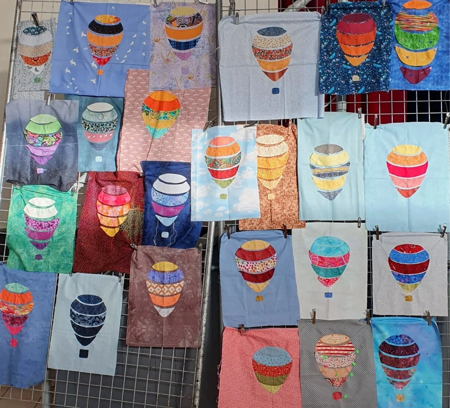
While there are some universal trends regarding colors and the psychological reactions they evoke, our physical perception of color is entirely individual, and therefore, so is our reaction. This shade of green soothes me, while my neighbor might find it quite boring. That's why choosing colors for your projects is first and foremost a very personal decision.
All this to say that the choice of colors for our projects can literally, to some extent, improve our quality of life. So, which colors should you choose? Of course, the choice depends on the context in which you use the color and the feeling you wish to evoke.
In general:
“Cool colors (blue, green, purple) can calm and focus the mind.
Warm colors (red, orange, yellow) energize and motivate us.
Neutral tones (white, beige, gray) create balance and reduce distraction.” (Adobe)
So, if we're looking to stimulate our senses, it's best to choose a bright and saturated color. But if we want to cultivate a sense of calm and focus, it's best to choose a lighter shade.
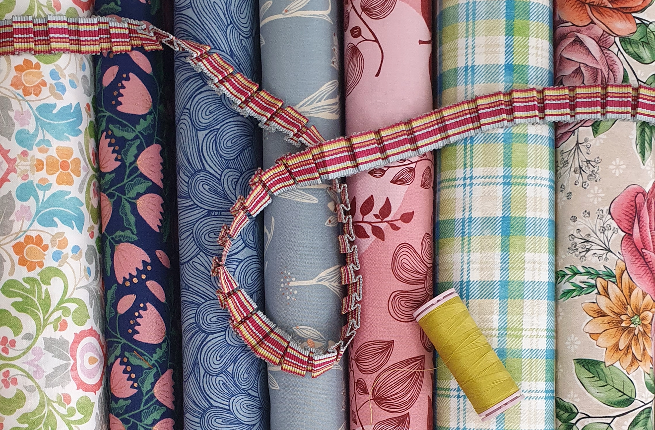
While we often consider the beauty of a particular color combination (if we find it harmonious or pretty), beyond our desired aesthetic style, we can also incorporate our well-being when choosing fabrics for a project. Because the person viewing or using the finished project will be impacted emotionally (and physically) every time they see the colors, regardless of the circumstances.
« Color is the unsung hero that subconsciously influences how we learn, feel, and behave. »
Having learned these concepts, I ask myself some additional questions when preparing my next personal project: Do I want to smile when I enter the room and see this wall art, or do I need to create a more relaxed and calming atmosphere? What is my primary reaction to this shade? Do I feel more agitated or perhaps indifferent? Seen from this angle, emotions consciously return to the center of my creative choices.
